EF Academy Brand Refresh
EF Academy | 2018
EF Academy needed to be differentiated from other EF-branded products. We created a strong, non-corporate, academic and individual identity for the international boarding school that helps it stand as an institution unto itself, built on trust derived from EF’s brand equity.
EF Global Creative, Lucerne
![]()
:quality(90)/f/51421/2557x1796/3a4fe7184e/academy_logosshields.png)
The Crest
The EF Academy crest was the symbol that would set the tone for the brand refresh. How do we represent global scholars without falling back on archaic academic icons that didn’t feel like us? Many, many, many iterations later, we found the solution: the letters E and F, plus EF’s 11.5º slash. It’s a book. It’s a face. It’s the full picture.
:quality(90)/f/51421/1882x1324/1ef1b52333/ef-academy-crests.png)
Working out the elements of the new academic crest
:quality(90)/f/51421/1186x1796/34ba376926/ef-academy-reception.jpg)
:quality(90)/f/51421/1186x1796/9c526b505d/ef-academy-signage.jpg)
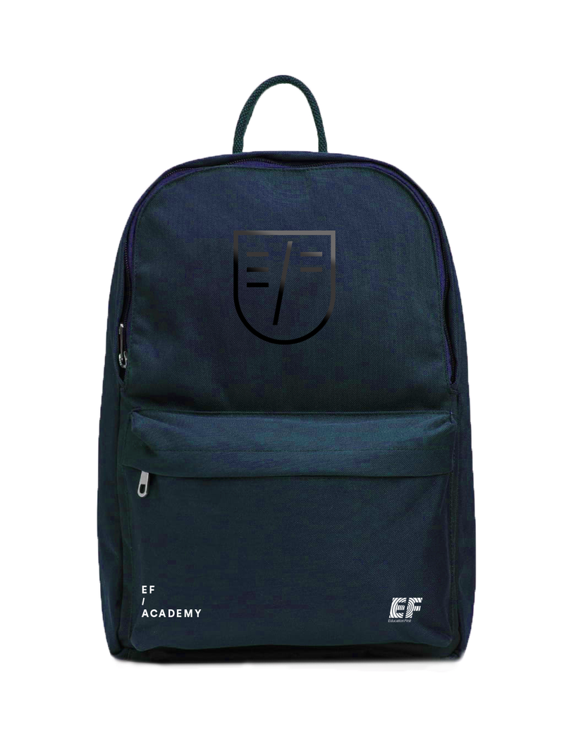
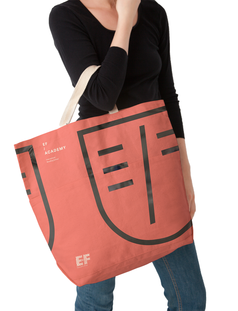
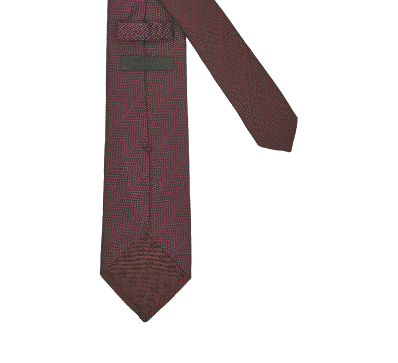
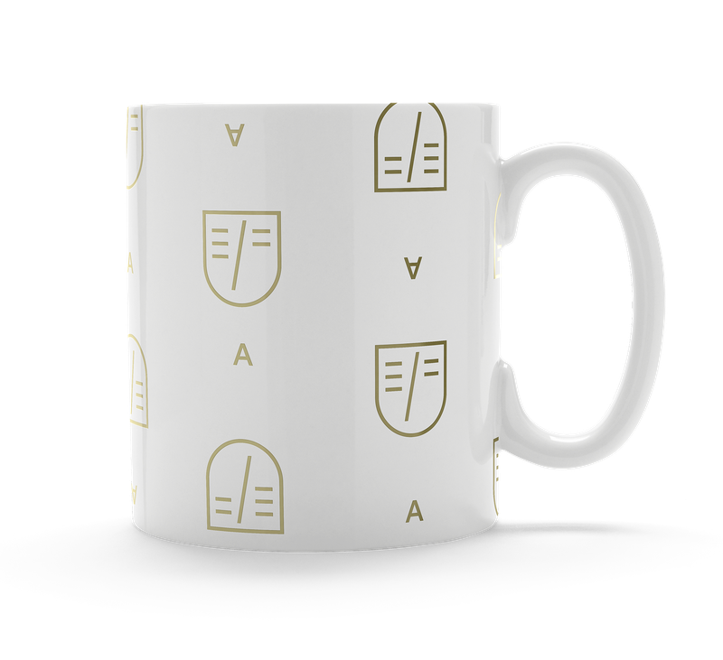
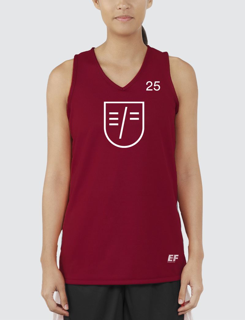
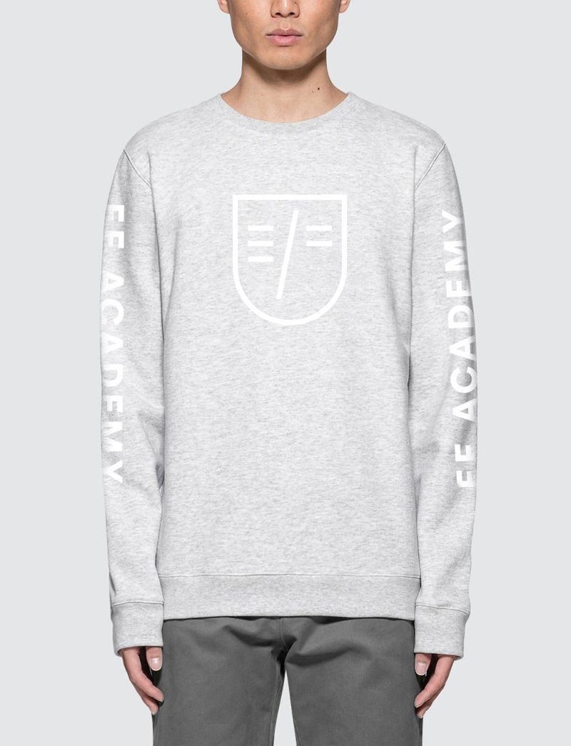
The EF Academy World
Once we worked out the elements of the new academic crest, we helped the school create a proprietary environment with it by applying it as a logo, as a textile, even as a wayfinding tool. Extending the brand into the print and digital spaces, we demonstrated how to use the crest and lockup to bring more adventurous, romantic photography into an academic context. EF Academy swag feels fresh and contemporary while leaving an academic impression, and the brand as a whole achieves a better balance of academics and adventure while retaining its legitimacy and integrity.
:quality(90)/f/51421/636x1048/7883826dac/ef-academy-testimonial-v2-1.png)
:quality(90)/f/51421/636x1048/6de3266817/ef-academy-testimonial-v2-2.png)
:quality(90)/f/51421/636x1048/ce5503402a/ef-academy-testimonial-v2-3.png)
:quality(90)/f/51421/4200x2800/250bb72139/academy_hero.jpg)
:quality(90)/f/51421/2126x3508/b43fec9e25/academy_flyer.jpg)
:quality(90)/f/51421/2126x3508/e439199cf4/academy_flyer2.jpg)
:quality(90)/f/51421/2126x3508/b08d53d495/academy_flyer3.jpg)
:quality(90)/f/51421/1098x1642/48f955e190/ef-academy-juice.jpg)
:quality(90)/f/51421/792x574/854ad156a9/ef-academy-sandwich.jpg)
:quality(90)/f/51421/428x621/36b94faecd/ef-academy-environment-1.jpg)
:quality(90)/f/51421/428x621/a8780d73de/ef-academy-environment-2.jpg)
:quality(90)/f/51421/428x621/5d27d0daa0/ef-academy-environment-3.jpg)
:quality(90)/f/51421/2847x1393/3098dbc3b3/academy_pencilsbook.png)
:quality(90)/f/51421/4961x3508/6070d07d4c/academy_pattern.jpg)
:quality(90)/f/51421/4800x2316/4a1d5271d4/frame-2.png)
:quality(90)/f/51421/2301x1800/ace7712b4f/thumb.jpg)
:quality(90)/f/51421/1920x1080/e655b160f5/hero.png)